We take a quick look at the new Moto 360 up against the even newer LG G Watch R! Both are round. Both are Android Wear. And both actually deserve some serious consideration.
For more on the Moto 360, visit http://phon.es/moto360
More more more on the G Watch R, hit up http://phon.es/gwatchr
Be sure to subscribe to our channel with this link! http://phon.es/acsub
You can download the Android Central App at http://phon.es/acapp
And follow us elsewhere!
The blog: http://www.androidcentral.com
Google+: http://google.com/+androidcentral
Twitter: http://www.twitter.com/androidcentral
Facebook: http://www.facebook.com/androidcentral

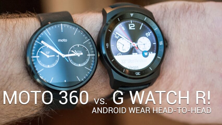


I recently bought the MOTO 360 and I really like it, its got the looks and as far as the technology goes it does it all. Yesterday I had a chance to look at LG R and I have to say I'm glad I bought the MOTO 360 as the LG R feels a little flimsy, it feels very light and in reality doesn't look as sturdy as on the videos . They both do the same things so its basically only down to the looks if someone is wondering which one to get. Comparing the two sizes, I have a skinny wrist and the MOTO isn't too big, on the other hand the LG, because of its shape doesn't fit as nice:) after seeing it live I'd say the plastic around the screen on the LG takes up the space and doesn't give much to the watch except for a smaller screen and sporty looks which after all don't look nothing like a g-shock watch:P
look at all the android sheep buying this crap. They are useless. Its like they are waiting for apple to create the market again so they can ride their wave.ÂÂ
The g watch looks way better, it looks like a real watch and more elegant better materials actually looks good overall plus the battery is way better, first watch with that big of a battery and doesn't look like a toy the 360 looks like my son watch
Dunno why, but the LG looks like rendered in the video. Both display and backside "wiggle" differently as the center part of the watch as the camera moves.
Ugly as hell that LG!!! no flat tyre thought!!
ãöðÑÂýðѠòþûþÑÂðтðѠруúð
Got the LG Watch R two days ago after cancelling my order for the Moto 360 because they kept pushing the release date in my country (Holland). I have to say, I'm happy that I did. The LG Watch R might look less casual than the Moto 360, but the round OLED display of LG offers true ambient mode without wasting too much battery. Trust me, it matters.
Looks nice. I guess I'll wait a few more months or maybe a year before getting a smartwatch though.
Ugly G WatchÂÂ
I love the design of the 360 way more than the R, but the R seems more future proof from the internals. The Snapdragon 400 does a perfectly cromulent job in my Moto G, it's very fast getting around the OS and browsing the web, even runs modern high end games well. If anything, it seems like way overkill for a smartwatch, but I'm glad there's power to burn in there. I wonder what the S1 in the Apple Watch has inside.ÂÂ
Waiting in the second version of the 360
Why don't these watches have a white version. I love white watches, especially white g shocks
That was a pretty shit vs. You just said that one was bigger and talked about pixel density.ÂÂ
they are both absolutely beautiful, but they seem to appeal to different crowds. I think personally the moto 360 looks more contemporary and modern, but the lg g watch r looks classier to me. I like both. but slightly leaning to the lg g watch r. the bezels are big, but at the same time make it look aesthetically more pleasing imo.
The LG might probably be better on display and specs but I really dont like the design at all, and I have very very small hands ( sucks) which is why I rather get the 360 since I feel like it looks better and smaller, Not saying LG watch sucks though, just prefer 360.
Is there any good reason to use a "smartwatch"?
Did he say that lg g r has plastic screen?
FFS guys just release the metal bands already. Not sure what the 3 month delay is
Do 360 owners honestly think it is nice or are they just trying to convince themselves that it is? I held one and I thought it felt really cheap and the display was pretty lousy compared to any modern cellphone display. I want a watch to feel like a watch and not some lighter than air plastic or really cheap metal alloy.
Sieht so scheisse aus mit dem schwarzen Rand oh man….
I think the LG g watch looks cheap, why is nobody comparing the Zen watch to any of these other smart watches? the Zen watch is a nice looking piece of hardware and deserves to be in this race of smart watches.ÂÂ
g watch needs segmented  bands like the casio g-shock watches.
The LG looks better, IMHO.
LG G Watch R the best.
Moto360 is good for me
Ugly all 3 watches
Doomsday
I really like how LG disguises the bezel with a bezel insert. It looks a lot more like a watch and less like a monitor strapped to your wrist. Unfortunately, looking at the two watches side by side, the bezel makes the LG watch look much clunkier than the moto 360. I would have liked it if the bezel was a bit lower and thinner.ÂÂ
I'm a female with regular sized wrists, and the Moto 360 already spans my entire wrist so the LG G watch R would probably look even more ridiculous on me. Between the two, I'd have to go with the Moto 360.
the two looks good
 they are both chunky. should be slimmer
Not much of a comparison…
LG G Watch R! The perfect circle! No hideous black bar!ÂÂ
the g watch is hideous. not even close to good looking. the moto 360 is on the right track. remove the black bar, make it thinner, and make it a bit smaller and it'd be the perfect smartwatch.
The LG looks nothing like their marketing renders. They spent a lot of time trying to make that turd look good.
still not into smart watches
LG G watch is ugly as fk
LG G Watch R
"The G Watch's beautiful display, slim design and long battery life make it remarkably comfortable to wear, all day, every day"
http://www.amazon.com/gp/product/B00LB2ZQ3C/ref=as_li_tl?ie=UTF8&camp=1789&creative=390957&creativeASIN=B00LB2ZQ3C&linkCode=as2&tag=facebookc0068-20&linkId=RTPMSQASNHUVYGGR
Felt like this review tried it's best to protect the Moto 360. Why not mention the R's completely round display, the larger battery coupled with a faster, more energy efficient (modern) cpu, and mention how the p-oled display also is better on battery life. All the Moto 360 has going for it is looks, and even that's not perfect with that black strip at the bottom.
Fuck apple
LG G Watch FTW!
Kinda like the rugged look of the LG watch though…
One day I truly believe one of the companies still trying to make a smartwatch will pull their heads out of their asses and made a wide smartwatch which will actually be big enough to realistic use. It seriously only takes like a 2" wide screen to make it easily usable with the continuum keyboard.